Aesthetics
Programmers typically do a very poor job with this one. My former co-founder and CEO of Imagine Learning often said, "Why is it that programmers love 8 point fonts? They need to be big enough for people like me to read!"I think the answer is simple. Programmers like to code features. If the IDE provides a drag and drop way for me to add widgets to my app, then the default font faces and sizes are good enough for me. And what was the default font for controls in Visual Studio in the days that programmers were learning to do UI? 8 pt Tahoma.
Startup programmers need to be much better at design. If you are sure you can't be good at it, then hire someone to do it for you. The default controls and style are just not going to cut it.
If you're going to give it a go yourself, here are some resources that we used:
Behance
Start by searching Adobe Behance for projects that you like. (Using the search term "UI/UX" will net some good app design results.) Note about what you like about each design. I created categories for color and fonts, flat design, icons, etc. You can see my collections here: https://www.behance.net/BJamUT/collections.I found that several of the designs I liked were done by the same artists. I started following several artists, and I get updates when they post new projects. This keeps me up to date on what's trending in app design.
color.adobe.com
Formerly kuler.adobe.com, this site has been a favorite of mine for years. With this site you can experiment with different colors to determine an attractive color palette for your app. We explored thousands of themes before settling on a couple that we liked and then we modified them slightly. Here are the two themes we used for Name Shark:
At the time of writing, the color palettes above look really familiar to the reader. :) Note how we have used the colors throughout the app:
Fonts
As is apparent above, we really liked thin sans-serif fonts. We settled on Helvetica Neue Thin, which was installed on Mac by default:
We wanted to use a similar font for our web fonts, and if you're looking for a nice, free alternative for multi-platform use, there are two fonts that we really liked on Google Fonts:
and
One final note on fonts: Make them big! Users like to see the text. If you can't fit the text on the screen, you're probably trying to put too much information on one page.
Icons
If you've made it this far through the page, I'm about to give you the best gem on this page: FontAwesomeKit. Available as a CocoaPods pod:
pod 'FontAwesomeKit', '~> 2.1'
FontAwesomeKit allows developers to use thousands of royalty-free icons that are vector format cleverly embedded into a scalable-vector format that was being used long before adoption of svg or pdf: fonts. Developers don't have to have Adobe Illustrator skills or create multiple versions for different sized icons. These font-based icons are added in code and they scale automatically.
We like this particular pod because, like other pods, it contains the FontAwesome icon font. In addition, it contains several other fonts--our favorite being ionicons.
About 75% of the icons in our app are from FontAwesomeKit. We did have to make some of our own icons to match the thin style of the iOS 7 icons in ionicons. For those we used Adobe Illustrator, and it happens that I have had some experience using Illustrator previously.
Even if you are not familiar with Illustrator or icon design, your app can look very clean, professional, and impressive by using FontAwesomeKit.
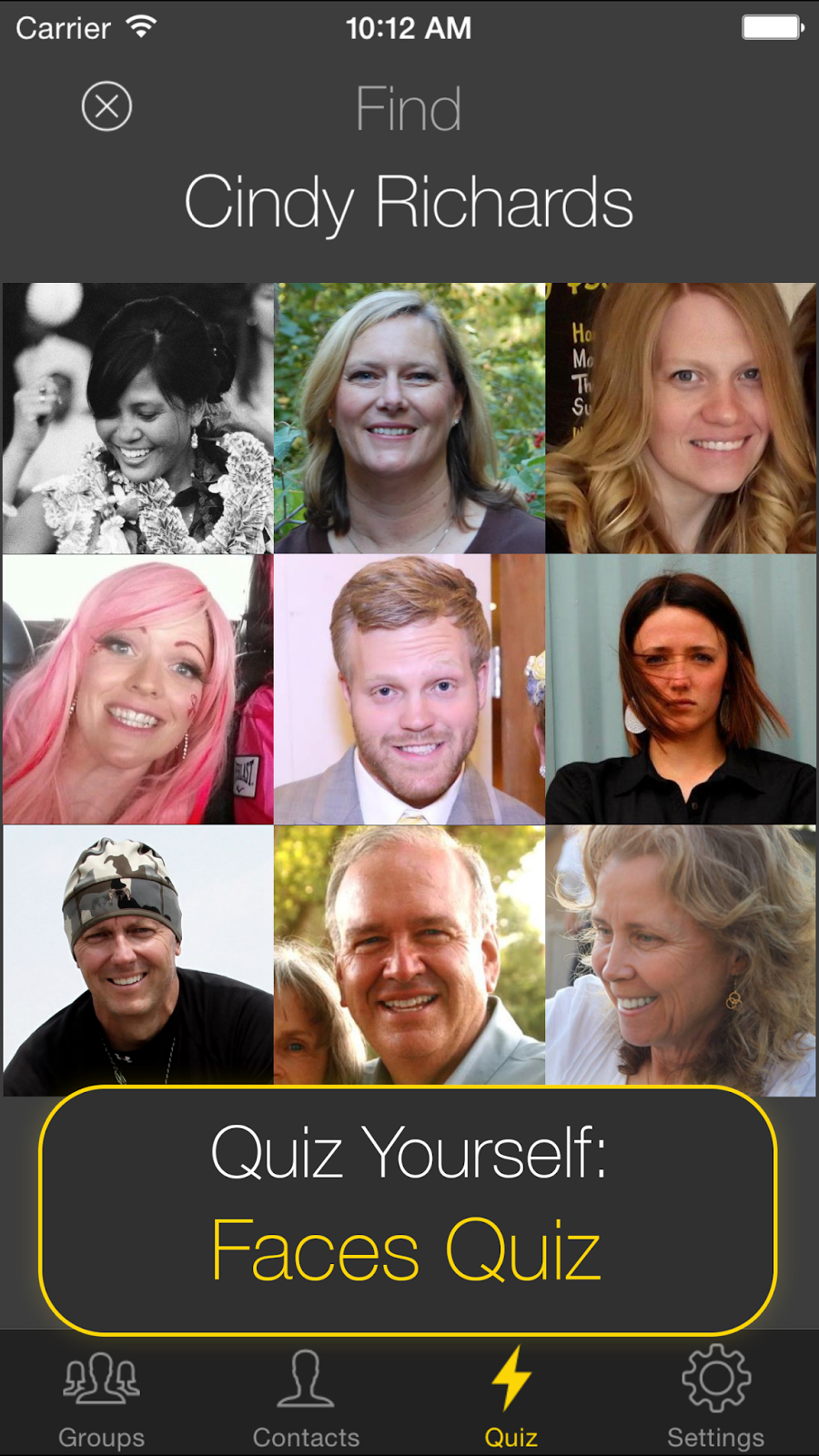
And here's the result of our focus on aesthetics prior to developing Name Shark:


No comments:
Post a Comment